Ford is one of the popular brands worldwide in the automotive industry and has enormous models of vehicles. Just like the company itself, the logo is full of meaning and history. It comprises of various interesting facts and changes over time due to some reasons.
Below we will take a deep look at the history of the Ford logo, its development, and design.
The History Of The Ford Logo
In 1903 this company was founded by Henry Ford. The brand was so far removed from the blue Ford logo that customers see today. It was green and was not reintroduced in the unique text you see today. The first Ford logo was much more complex, with a combination of extra text and embroidered edges.
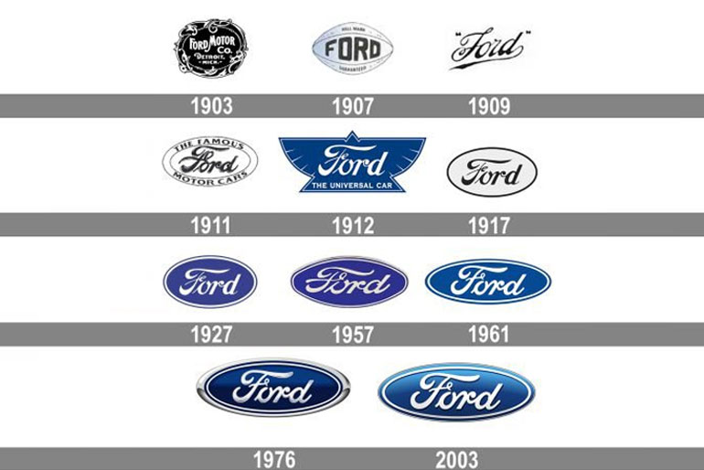
The company did not display the iconic Ford inscription on the first Ford Model A. Ford typically used it in all company communications. Apart from the famous story that the Ford logo is Henry Ford’s signature, it was designed by its first chief engineer and designer, Child Harold Willis.
The Ford inscription first appeared in the famous Ford logo in 1907. It has been included in all Ford logo editions since then, but the text has changed slightly.
Twenty-four years after Ford was founded, the company changed the logo to a design similar to its current uses. The brand has had three official version logos since 1927, all of which are very similar to the current version. They all made minor changes, such as making minor changes to the Ford inscription and making the ellipse a little more rounded.
Evolution Of The Ford Logo
Ford’s oval symbol is one of the most recognizable corporate emblems worldwide and has been used consistently for over half a century. The inscriptions originated from Ford’s origins when Assistant Engineer Henry Ford introduced a stylized version of the phrase “Ford Motor Company.
1903 Logo And Letter
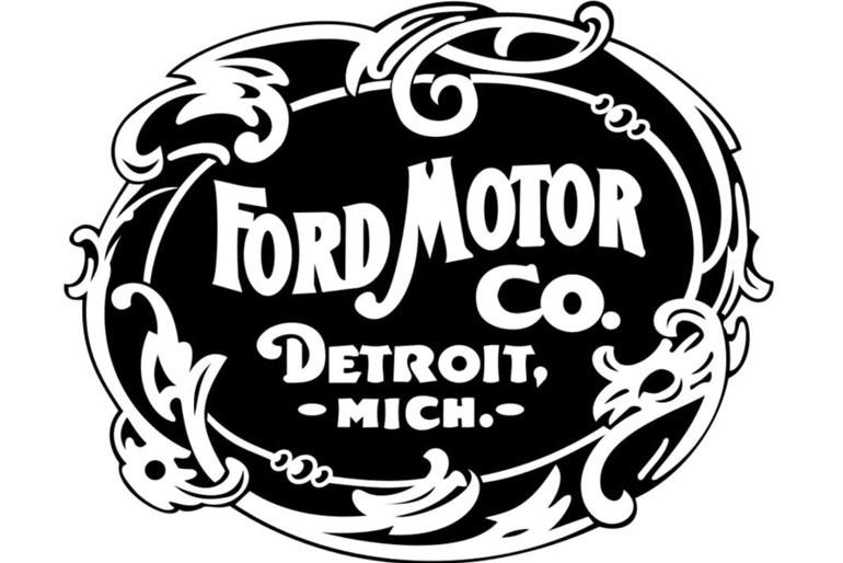
Ford first used the Ford inscription in company communications in 1903. However, the first automobile manufactured (Ford Model A) received special treatment. Ford designed the first car logo with a very stylish Art Nouveau border.
1906 Winged Script
In 1906, a more advanced form of Ford’s inscription appeared with the long tail letters “F” and “D” and was called “winged script.”This Ford logo design was placed on all Ford models until 1910 when the inscription was revised to the version still in use.
In 1909, the Ford logo was patented in the United States.
1907 First Oval
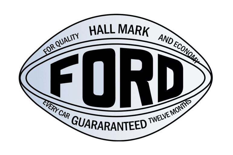
In 1907, British ambassadors Perry, Schreiber, and Thornton unveiled a golden Ford emblem. They were the predecessors of the first Ford Motor Company in the UK. This oval advertised Ford as “a microcosm of reliability and economy.”
1909 Quotation Marks
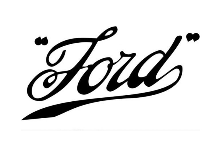
It’s one inscription-handwritten stroke. “Ford” is written in a harmonized typeface that mimics handwriting and is quoted in two compound dots. It is decorated with many curls and rounded shapes and has a long tail that extends from the “d” to form the bottom line.
1911 Distinctive Oval
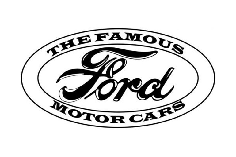
Ford designed a unique oval logo in 1911 by combining an oval with a Ford inscription. The company used this design to identify UK distributors primarily. However, Ford automobiles and communications continued to use Ford inscriptions until the late 1920s.
1912 Universal Car
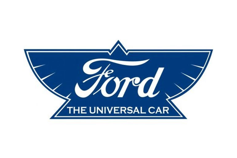
Ford ditched the oval emblem and replaced it with a winged triangular symbol. Created initially to symbolize lightness, speed, stability, and elegance, the Ford logo design was dark blue or orange and used “universal car.” The founder hated the logo, and it was immediately littered with garbage.
1917 White Oval
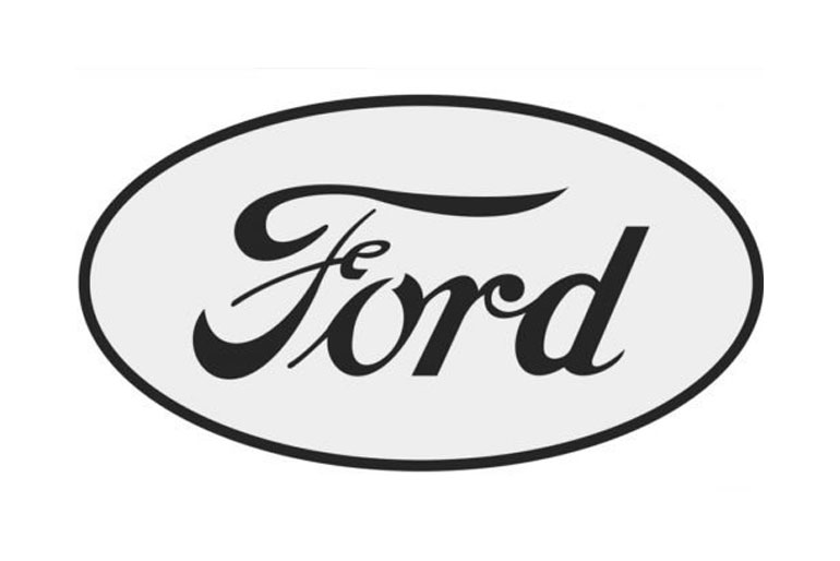
In 1917, Ford finally decided on the image that the brand still carries today. It was a canonical name set in a simple white oval with black edges. The text was also black, which gave the whole logo an effortless look.
1927 Oval Sign
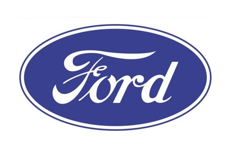
In 1927, the new Ford Model A was the first Ford car with an oval logo. With the famous deep royal blue background you know today, many cars saw the mark until the late ’50s. The oval symbol was regularly used in corporate communications until 1976.
1957 Football Form
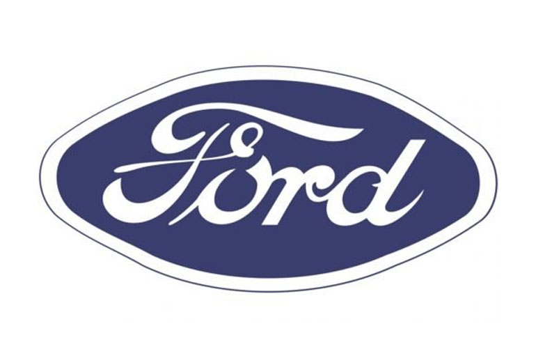
For several years, the brand has returned to its strange football form. Everything was pretty much the same in this version, but the diagonal edges were squeezed for some reason. The color was also a little pale.
1961 Oval Shape
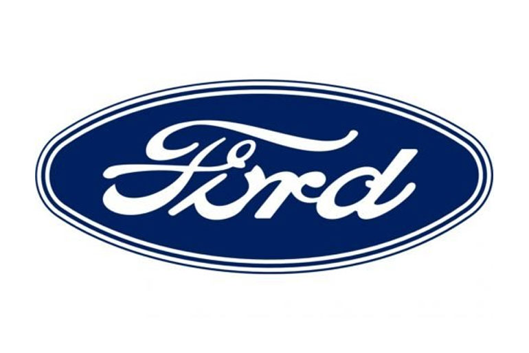
After that, the logo went back to an almost oval shape. There were differences, such as the much darker blue and the additional white and blue outlines. But these were just a few attempts. The company regularly changed the details in such a small way. However, the spirit and composition of the logo will not change.
1976 Blue Oval
Since 1979, all Ford cars have been marked with a bar of silver and deep royal blue oval. It has provided a well-known and trusted brand to all Ford products, facilities, and factories worldwide.
2003 Dark Blue
However, this was taken up primarily to represent brands other than car fronts and interiors. A dark blue text said “Ford Motor Company” in the same font and style, similar to Ford’s signature. It was quickly discarded in favor of another badge.
Ford Logo Design Elements
-
Ford Logo
The Ford logo is flat oval designed in several white and blue tones. Oval contains the famous and glorious Henry Ford signature. Ford Motor Company constantly reiterates the importance of recognition, tradition, and style, with only minor changes to its brand throughout its long and successful history.
-
Ford Logo Fonts:
The famous Ford inscriptions are made with custom fonts that closely resemble Ford, similar to the refined and stylish Neville Regular and Fabiola fonts. The description is believed to have been inspired by the signature of Henry Ford.
-
Ford Logo Colors:
Ford logo designs have long been synonymous with the world-famous deep royal blue shades. The latest Ford logo was introduced in 2003 to celebrate Ford’s 100th anniversary and features various shades of blue, including navy blue and sky blue.
The Ford lettering is white, and a white oval line is also built into the design. At the beginning of the Ford Empire, the logo was black and white.
Ford Logo Popularity
The Ford logo retains the famous blue oval, which looks more modern due to the silver lining and white veils on the font. Simple and elegant, everyone knows it well. It is considered one of the successful car brands in the world.
The term “blue oval” began to appear in books in 1907. There was no exact date when the nickname Blue Oval became popular. After some research, we concluded that the phrase “Blue Oval” appeared in 1907.
Different Other Ford Logos
-
Make Ford Mustang
Probably one of the best-known cars that Ford has produced is the Mustang. The brand has a running Mustang horse, and it’s a great implementation of the idea of speed and freedom that should be at the core of Ford Mustang cars. Indeed, this is another Ford brand that looks good and will be remembered throughout history.
-
Make Ford Raptor
The Ford Raptor logo is more of a font showing that it just got off the road. Looking at the Raptor vehicle, we can consider that their choice is quite a good one.
-
Ford Focus Brand
Another Ford icon we love is the famous Ford Focus logo which has a beautiful script that looks like handwriting. All the letters are connected as handwritten words. There is also a Focus logo that has an unusual “f” and “u” along with a logo that has an available font.
Conclusion
Finally, the Ford brand has evolved a lot over the years and is, without a doubt it is one of the famous logos in the automotive world. It shows how well-chosen designs can last for decades and make companies known in many cultures and countries.


