Nowadays, people can easily guess the logos of different cars, but they don’t know the history, meanings, and why they are designed this way. Lets’s take a look at the Alfa Romeo logo.
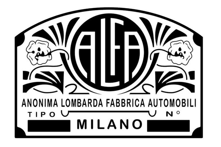
Alfa Romeo is a Stellantis company and an Italian luxury automobile manufacturer. The corporation was established in Milan, Italy, on June 24, 1910. The acronym “A l f a” stands for “Anonima Lombarda Fabbrica Automobili,” which was the company’s original name.
The investors who founded the company were unknown. Therefore, it was named “Anonima,” which means “anonymous.” To make vehicles initially, the firm purchased Darracq’s Portello manufacturing building in Milan, which was winding down and selling its assets.
Since 1911, the company has been active in car racing and is recognized for sporty vehicles. Fiat Chrysler Automobiles, which was responsible for manufacturing Alfa Romeo vehicles until it entirely combined its activities with those of the P.S.A. Group to become Stellantis on January 16, 2021, was the business that owned Alfa Romeo.
History Of The Logo
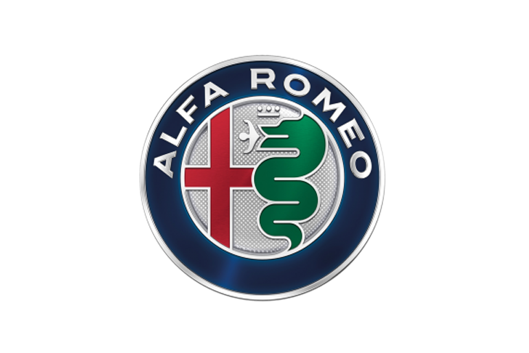
Alfa Romeo’s logo includes two heraldic elements traditionally linked with its birthplace, Milan: a red cross, which is the city’s badge, and the biscione, a large grass serpent eating a kid, which is the symbol of the Visconti family, who ruled the city in the 14th century.
The Società Anonima Darracq renamed itself Anonima Lombarda Fabbrica Automobili in June 1910 and was preparing to launch its first model, the 24 HP. The board of directors requested head engineer Giuseppe Merosi to design a logo for the new car’s radiator shell, and Merosi appealed to his colleagues for help.
One of them, Cattaneo, was inspired to add the biscione in the logo by the coat of arms he saw on the gates of Castello Sforzesco. Merosi loved the concept and collaborated with Cattaneo on a drawing, which was accepted by managing director Ugo Stella, and Cattaneo was tasked with the final design.
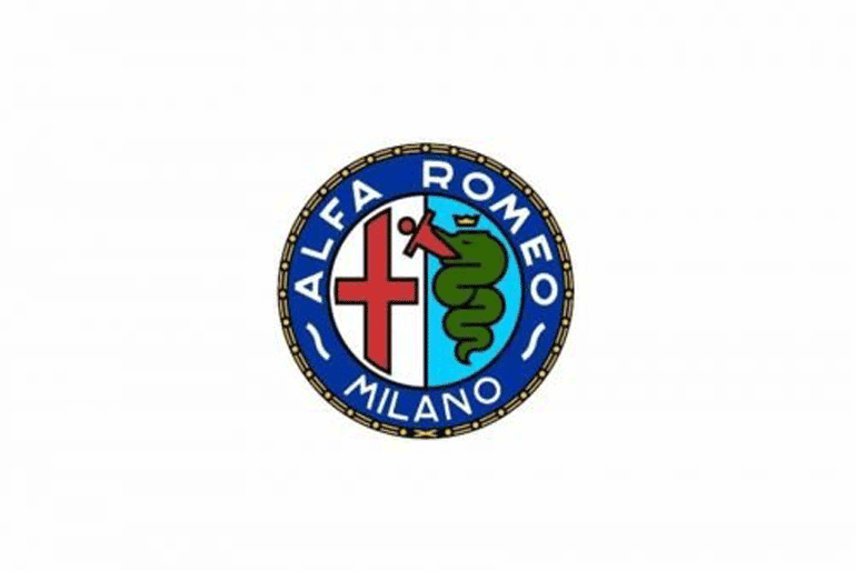
The original badge was disc-shaped, unglazed Brass, 65 mm in diameter, and had all of the modern accessories: a red cross on a white Milan field on the left, a green biscione on a light blue field on the right, all surrounded by a blue ring inscribed with the words “ALFA” at the top and “M.I.L.A.N.O.” at the bottom.
In 1913, altered the writing from solid Brass to white enamel. After Nicola Romeo purchased the firm in 1918, he changed the term “ALFA” to “ALFA-ROMEO.”
Birds Eye View Of The Badge
Alfa Romeo dates back to 1910 in Milan, so it’s no wonder that the brand’s emblem can lay claim to a piece of history. We can trace the Alfa Romeo emblem back to ancient Italy! But, above all, it is unforgettable.
The picture portrays a gigantic snake wearing a crown and eating a guy whole. A strange scene is sure to be remembered.
The Left Portion Of The Alfa Romeo Logo
When Alfa Romeo was founded in 1910, draughtsman Romano Cattaneo based the corporation’s symbol on a symbol he saw on the entrance of Castello Sforzesco in Milan. Because the firm was started in Milan, it felt fitting to use a city symbol. Designer Giuseppe Merosi was able to turn the concept into Alfa Romeo’s official logo.
The design has stayed very constant throughout the years, with slight changes to the lettering, gold trim, and wreath look. The emblem’s left side has a red cross on a white backdrop, a medieval Christian sign.
Milanese troops linked with Giovanni of Rho wore a red cross and white underwear beneath their armor during the Crusades. Giovanni of Rho is recognized for bringing an army to the Promised Land and raising it across the gates of Jerusalem during the first crusade.
The Right Portion Of The Alfa Romeo Logo
On the right side, a gigantic snake devouring a crimson man symbolizes the renowned Visconti dynasty of 11th century Milan. The picture, known as a Biscione, has become a symbol for Milan, appearing in several locations across the city. The crown dated from the 15th century when the Viscontis became dukes.
The origins of the sign and what it represents have long been a point of contention. The following are some of the most plausible explanations:
- It alludes to a local tale about a dragon that terrorized the region in the fifth century before being slain by Uberto, Squire of Angera.
- During the first crusade, archbishop Ottone Visconti used this crest while leading crusaders into combat against Saracens (Syrians/Muslims), a Biblical sign of divine protection.
- It’s the crest from the vanquished nomadic Saracen knight Visconti’s shield, which he kept as proof of his triumph.
- The snake is a sign of the House of Visconti, and it is supposed to be threatening to others.
- The snake is giving birth to a human being oral, emerging as a “new man, cleansed and renewed,” much as the monster itself is undergoing regeneration through skin shedding (according to Alfa Romeo representatives).
- It depicts the good luck snakes that Lombards wore around their necks.
- Arnold II of Arago, who served as archbishop of Milan from 998 to 1018, may have brought a bronzed snake souvenir from Constantinople to the city, explaining the icon’s connection to Milan. The components that have defined all nine Alfa logos are that picture and a depiction of Milan’s official flag—a red cross on a white backdrop.
The Evolution Of The Logo
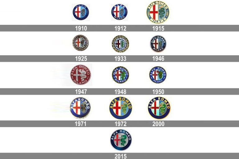
1910-1915
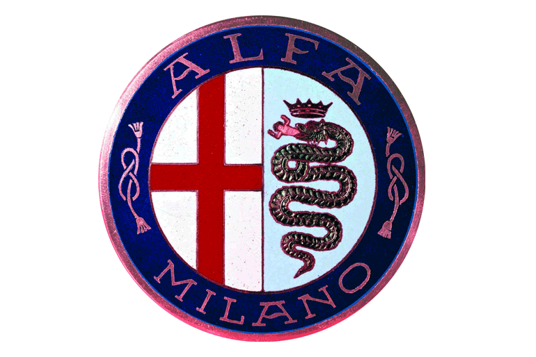
The original interpretation of any design is generally the simplest and purest. The Biscione is seen consuming a person, a kid, a Moor, or an Ottoman Turk. The crown on the serpent’s head differentiates this official Milanese sign from the Visconti family’s symbol.
Double ropes seeming like digit eight divide the words A L F A at the top and M I L A N O at the bottom, a sign of the royal House of Savoy, a lineage of which united Italy in 1861.
1918-1925
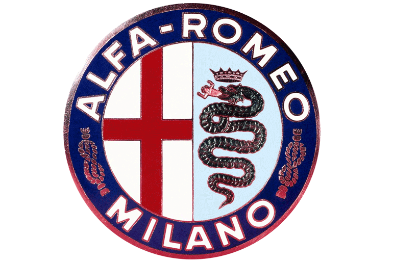
As World War I broke out, the banks who held A.L.F.A.’s debt transferred the company over to Nicola Romeo, a Naples businessman. Pumps, weapons, and aviation turbines were all produced in the company’s Portello (ex-Darracq) facility.
The business was renamed Alfa-Romeo when automobile manufacture began, and they changed the logo to reflect this, using a more linear typeface.
1925-1945
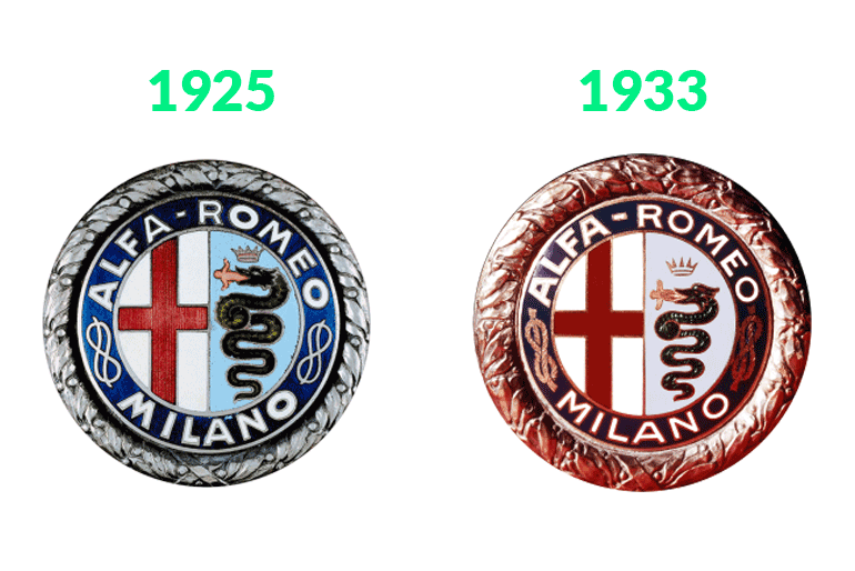
Furthermore, they changed the logo with a golden heather crown to memorialize the Alfa P2’s victory in the first world racing car championship. Antonio Ascari was driving in the European Grand Prix at Spa, and Gastone Brilli-Peri won the Italian Grand Prix at Monza after Ascari’s horrific accident.
1946-1950
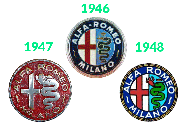
Two wavy lines replaced the Imperial knots once the Italian monarchy fell. However, the WW-II bombing severely destroyed the whole Italian industrial base, including the provider of Alfa’s multicolored brand badges. That’s why it is crucial to this alteration.
With its less intricate golden laurel wreath frame and fatter, the smoother snake with fewer coils, this considerably reduced design was easier to create in two-tone gold on red. The individual consuming was likewise positioned at an awkward angle. It was Alfa’s most radical makeover, but it was also its shortest-lived.
1950-1971
In the same year that Giuseppe Farina won the first Formula One World Championship in an Alfa Romeo Tipo 158, Alfa Romeo won again with Juan Manuel Fangio in a Tipo 159 equipped with a 1.5-liter 425-hp supercharged straight-eight engine capable of 190 mph.
It was, however, a methanol guzzler, getting only 1.2 mpg. Alfa dropped out of Formula One in 1952 to focus on more profitable mass-production vehicles like 1900.
1971-1972
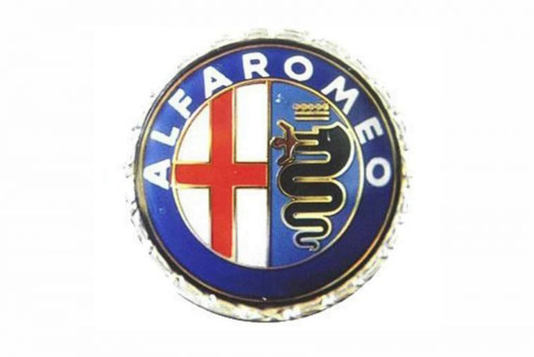
The company toned down the detailed scale texture of the snake, the human body, the undulating pattern in the blue border, and the vertical line texture in the red cross in this design modification. The reason behind this change was that Alfa Romeo wanted to maintain the style of the logo by using special plastic instead of Brass. He wanted more neatness, attractive color tones, and a cooler version than the last one.
1972-2000
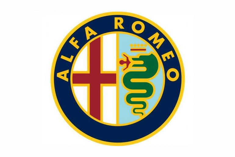
The removal of the wavy lines and the term “Milano” in acknowledgment of Alfa’s business The removal of the wavy lines and the term “Milano,” acknowledging Alfa’s business growth beyond the Milan surroundings, is the most significant change in this makeover.
In Pomiglianod’ Arco, near Naples, they built a major factory to produce the new Alfasud mini and a newly designed road course in Balocco, Piedmont.
2000-2015
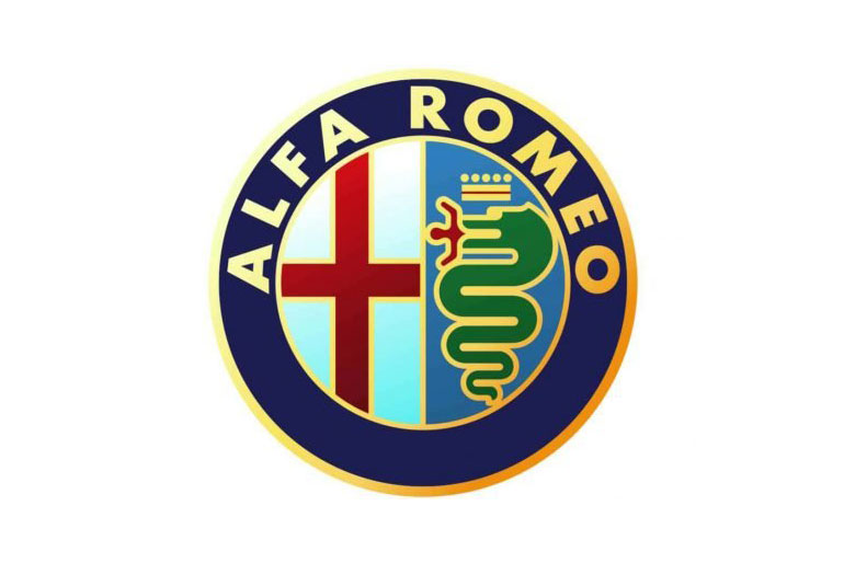
The previous version had lost the snake’s knot or coil right underneath the human, as well as one less back-and-forth zigzag in his torso. This modification maintained the trend toward graphic simplicity of the design that had begun with the preliminary design.
The remains of the laurel wreath frame were removed this time, and the company changed the typography to a simpler Futura font. It is Alfa’s longest-running logo design to date.
2015-Present
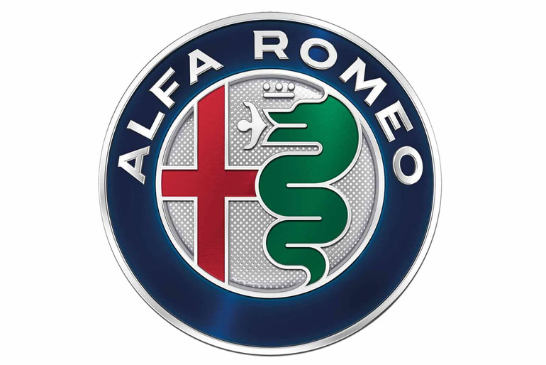
Robilant Associati of Milan tweaks the typeface once again in this final form. The separation bar dividing the cross and the man-eating reptile is eliminated, enabling the snake to expand. The fatter snake has one fewer zigzag, and the blue and white backgrounds have been replaced with a single silver textured field. The Robilant & Associati studio created an aggressive logo restyling to reflect the brand’s new positioning.
Conclusion
Almost every single Alfa Romeo emblem is linked to the company’s Italian heritage. The Visconti crest’s snake motif was naturally picked for the Alfa Romeo emblem.
Milanese residents would have recognized the image because it is widely displayed in city architecture. A Biscione, for example, maybe found over the doorway of Castello Sforzesco, a 15th-century stronghold built by Francesco Sforza, Duke of Milan.
A.L.F.A. became Alfa Romeo after Nicola Romeo took over the firm in 1915. Except for the wording, which was changed to “Alfa Romeo Milano,” today’s Alfa Romeo emblem is almost identical to the original form 1911.


